


How and why we use gut reaction tests to start our kick-off workshops
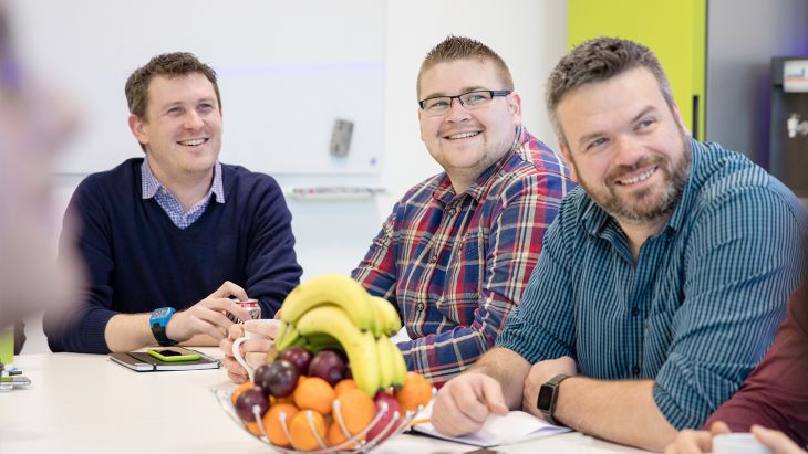
We love kick-off workshops. They are a fun but structured way of getting to know our clients and understand what they want from their app. The aim is to create a space where they can open up to us and feel comfortable to share their visions.
We like our clients to feel relaxed during their kick-off workshop, that’s why we let you know beforehand exactly what to expect.
We usually use an activity called a Gut Reaction test to break the ice...
In our last workshop, positioned quite comfortably on our sofa, a client shrieked when one of our team handed her a pad of post-its and a pen; ‘Oh no, you’re testing us!’
Our project administrator Caz can easily relate to that feeling; ‘I was familiar with that fear of expectation. The horror at the discovery that my input was audibly required and my score written up on the whiteboard for all to see.’
The shame of my 1/5 rating against the experienced Brightecoids with their wealth of app knowledge and considerably more positive gut reaction score to this particular slide. Equally, there was the relief when someone else was picked to offer up their rating of a particular app first. The guilty glee of changing my pledge to mirror that mighty Brightecoid before me.
Then the horrible bright idea someone had that we should write our scores in future so that people couldn’t ‘cheat’ (hence the post-it notes and pen mentioned above). Were they on to me?!"
Don't worry we weren't trying to weed out the cheaters! The 'test' isn’t to make assumptions about our clients or form judgements on their design tastes. We don't laugh secretly about how little they know about app usability.
The purpose of our gut reaction test is to get a general idea of what the client finds visually pleasing (and displeasing).
It’s all very well creating spec docs and RFP’s with all of those horrid subjective phrases to try and describe design but, realistically, everyone’s expectations of what a ‘modern UI’ looks like is going to be different.
Design terms are so free flowing, our simple test helps us to get an idea of what a client is expecting their app to look like.
This also helps us get a feel for where the client expects their budget to get them. And we can then see whether we need to adjust that expectation or not.
If a client only has a limited budget, but expects that their app is going to be filled with clever animations and custom UI elements, then we need to nail that early on.
We run our gut reaction test by choosing 10-12 apps and creating a presentation with three screenshots per app. We then display each app for 20 secs and ask everyone in the room to rate the app from 1-5.
1 = They hate how it looks
5 = They love it
We then collate those scores as we go and discuss the top and bottom scoring apps to understand why people gave those scores.
We choose a range of apps, but none of them are our apps that we have worked on. So everyone can be as honest as possible.
We choose a mixture of apps that may be competitors in their market, well-known apps and some obscure ones that no one will have seen.
We also choose apps that we both do and don’t like the UI of.
YES! The gut reaction test is one of the most useful activities we do in our workshops.
Often there are a few surprising scores and even within the Brightec team, we can differ in our opinions.
However, it’s the shocking scores that generate the most discussion and help to tease out of the client their real likes and dislikes.
Of course, when we are discussing other people’s work in a safe environment, it's easy (or easier at least) for everyone to be brutal and fulsome in praise with their feedback.
Our designers take extensive notes of people's answers throughout the test, this allows them to get moving quickly on the design, confident that they aren’t going to go in an undesired direction.
During the workshop, our designer Jotham will use the notes from the test to question further the clients likes and dislikes in visual design as we go through the different activities.
We usually introduce the activity by saying a few things like:
We put the test up on our projector, put on some background music and use a timer to give people 20secs to look at each slide.
Once the 20secs is up we then go around the room (varying whom we start with) and ask for scores, write those scores up on the whiteboard and discuss once we are finished.
That’s the first activity done and the ice broken. Hopefully, by this point, we have got everyone talking and their ideas are starting to flow.
Read more about our kick-off workshops here.
This article was written jointly by Caz Houghton and Josh O'Riordan.
Search over 400 blog posts from our team
Subscribe to our monthly digest of blogs to stay in the loop and come with us on our journey to make things better!
We develop intelligent mobile apps for iPhone & Android that deliver for you.
Want to connect? You can find us on Instagram, Facebook, X (formerly Twitter) and LinkedIn.
Here’s our privacy policy.
Here’s our Accessibility statement.
Copyright © 2024 Brightec Limited. All rights reserved.


