


These may seem tedious, or even dull...some might even seem obvious or self-explanatory, but these tips are all guaranteed to provide your asset family with the polish it deserves.
Specifically, I'll be talking about iconography (images are a slightly different kettle of fish).
In this post, I'll share some thoughts on how to best prepare an icon to be export ready.
Always work at 1x size in Sketch. It'll make exporting so much easier.
If the asset includes multiple objects, make sure they are correctly aligned to each other before exporting.
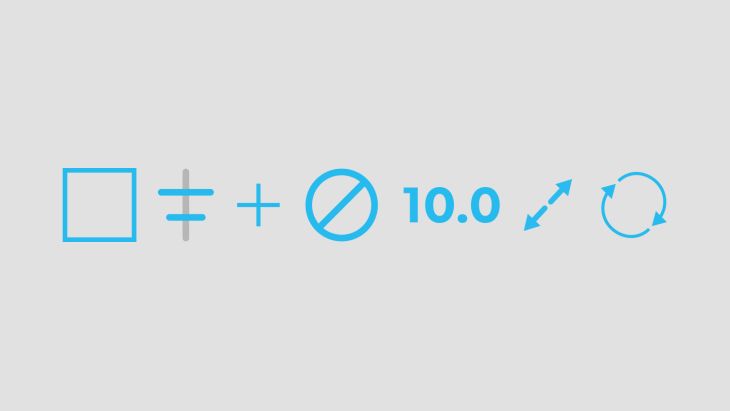
For example, let's say you have a button that is made up of a coloured square with a plus icon inside.
You'll want to ensure that the plus icon is centred both horizontally and vertically to the square.
It is good practice to use shapes instead of fonts.
Sticking with the plus icon example, it’d be better if the plus icon was a drawn object (easily made from two rectangles joined together). Rather than a plus icon made from a font.
This allows us much more control of the object and makes it easier to scale and align.
If at all possible, try to avoid using strokes and instead use shapes.
This makes for a cleaner export process when supporting some older versions of Android. It creates a better success rate for exporting SVGs.
Make sure that the icon in question is a nice perfect pixel size, don’t let any decimals sneak in there.
If you need to resize it, make sure that your edit does not stretch your icon beyond the intended proportions.
For certain elements, it is important that the dimensions of the icon file are actually larger than the shape itself.
For example, the plus shape might be 18x18 but the artboard of that shape should 24x24, and exported at that size.
This helps to layout a series of icons in a balanced way as all icons will have a common logic for their bounds.
Since Sketch 3.7 its become good practice to make all your icons and assets into Sketch symbols.
This allows for quicker changes to all instances of the asset during the design stage. It also makes for a better export process, because you can simply work through the symbols page.
Name the symbol the same as you intend for the final file. For example, don't call it "Plus Icon" in Sketch because you'll have to rename it to "ic_plus" or "PlusIcon" anyway.
Doing all the above should give you a nice clean asset. But there are deeper level things to consider.
Your asset should feel like it belongs in your app. It should communicate appropriately and sit comfortably alongside the other icons in the project.
For more thoughts on that, read our Focus on iconography post.
Hope that helps!
Search over 400 blog posts from our team
Subscribe to our monthly digest of blogs to stay in the loop and come with us on our journey to make things better!
We develop intelligent mobile apps for iPhone & Android that deliver for you.
Want to connect? You can find us on Instagram, Facebook, X (formerly Twitter) and LinkedIn.
Here’s our privacy policy.
Here’s our Accessibility statement.
Copyright © 2024 Brightec Limited. All rights reserved.


