


Focus on Colour
Colour is power
This is the first in a series of blog posts which will focus on some of the core elements of designing a good user interface. In this first post, let’s look at colour.
Colour is one of the most powerful communication tools that we have as designers.
Colour helps us make decisions every day. Whether its keeping safe at the traffic lights or telling us that the oranges in our fruit bowl have gone off.
Colour communicates important messages without even a word.
In the world of mobile design, it is equally important. It helps the user understand whether an action they are about to perform is a positive one or a negative one.
It helps create a tone of ‘voice’. For instance, will the app be serious or playful? Can the app be trusted? Is this app authentic? Colour can communicate all of this.
Ugliest app?
In most cases, most apps tend to do things well. We can learn from their successes and build on them ourselves.
However, from time to time, we come across apps which are less than impressive. Fortunately, we can also learn an immense amount by examining which potholes they fell into so that hopefully we don’t follow them down.
For this post, let’s take a quick look at the UI on WhatsApp’s iOS app.
It is one of the most successful apps in the world with over a billion (at the latest estimates) monthly users. Yet, quite astonishingly, it’s iPhone app is also widely accepted as one of the ugliest.
You could argue that this disproves what we’re about to argue, a billion users can’t be wrong. However, any good designer will screw up his face and mutter with disgust something along the lines of ‘this is the exception that proves the rule…’ (we’ll come back to this later).
Let’s ignore for the moment why their iOS version looks like they don’t care half as much for it as they do for the Android one (there are plenty of legitimate reasons to explain this).
Instead, let’s focus on how it falls short of what we might consider to be good UI goals.
Make your mind up
This is the app icon:
![]()
All fine here. The green background with the bold white WhatsApp mark is pleasant, clear and recognisable.
Of course, the keen-sighted of you will have noticed that the green is almost an exact copy of the green Apple use in their Messages and Phone app. Oh. Also, the icon is basically a combination of the iOS Messages and Phone apps (I’ll look at iconography later)...
Anyway, surely this bright green will be the main colour in the app, right? RIGHT? Wrong.
Upon opening the app you’re left wondering if this is some kind of early test build.
A prototype? A screen test? A monumental mistake of some kind perhaps?
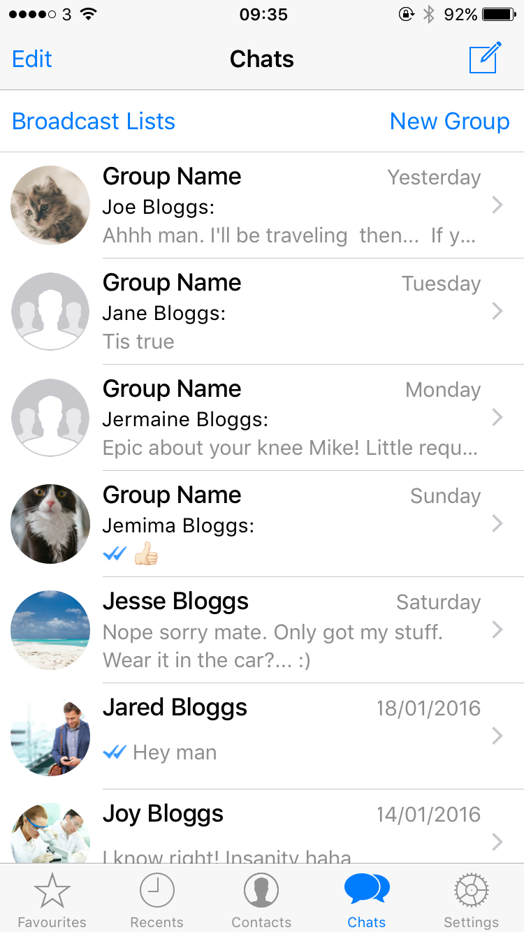
A largely white and grey inbox screen greets us, with Apple’s default blue still used as the main UI Tint colour. There is no brand colour present whatsoever.
Most startlingly, there is almost nothing in this screen to tell me that I’m in WhatsApp.
The only things that even attempt to achieve that are the blue ticks alongside messages that indicate they’ve been received and read (a fine feature we should add). Surely it should be more than just ’ticks’ that indicate we’re in WhatsApp?
At last, some colour is found in the conversations. Quite a few in fact. Although they’re muted and used in small measures. At least 10 in-app colours can be found.
WhatsApp! make your mind up!
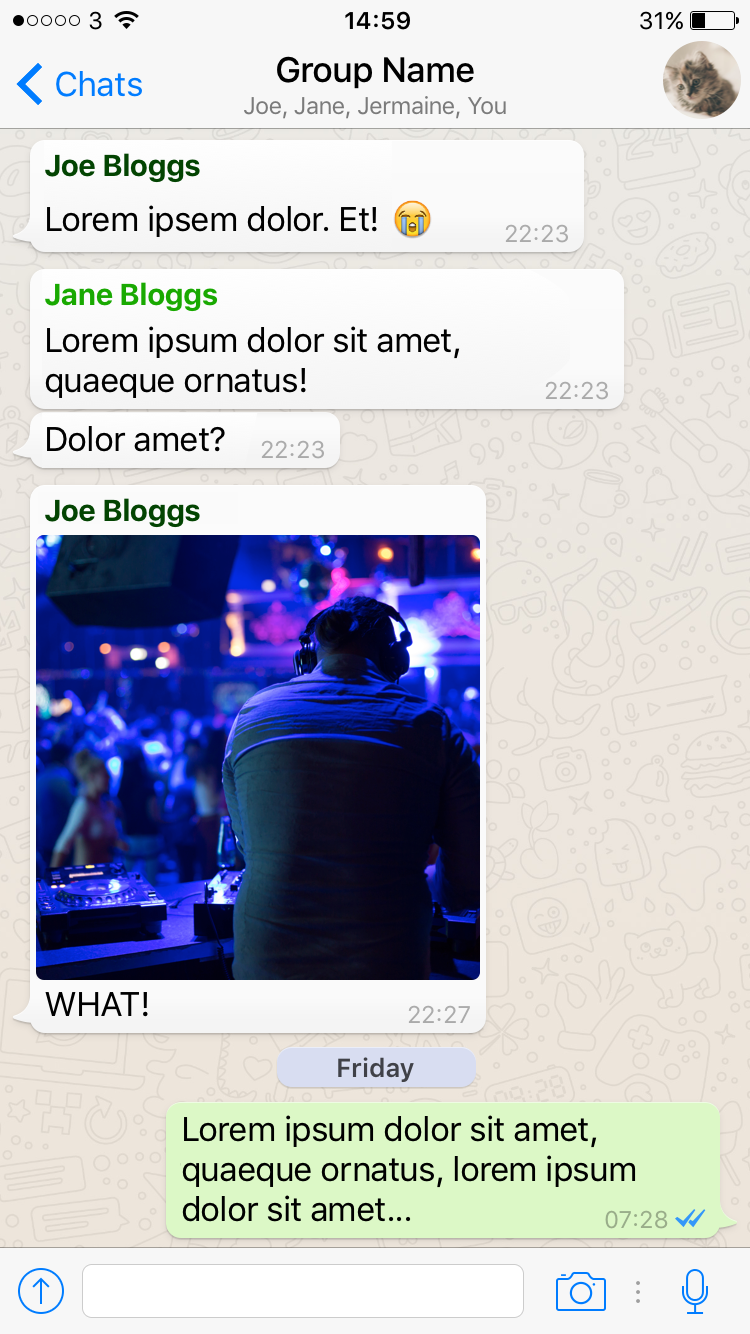
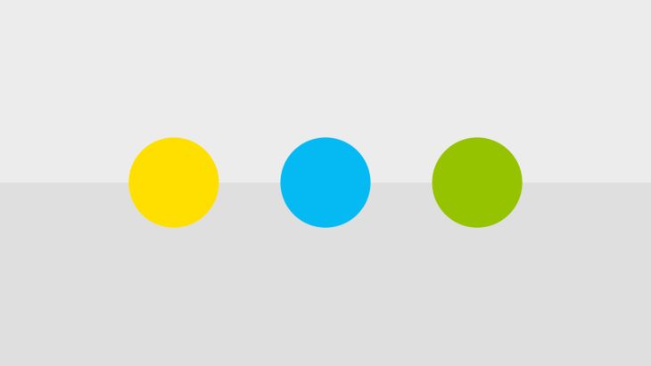
Here’s every in-app colour found on this screen, nicely extracted.


The number of different colours is impressive (in a bizarre, incoherent sort of way), but the main bugbear is that although there are 3+ shades of green, none of them are the stand-out greens that were present in the app’s icon.
A billion users can't be wrong
In summary;
- The launch icon is ok but is an almost carbon copy of Apple’s suite
- The inbox screen is as naked as the day it was born
- The conversation screen has more visual variety than a Kellogg's holiday cereal pack.
Wait a second - what about those billion users? This app is a massive success! How so?
Because, put simply, function is more important than form (at least in this case). The ability to send group messages to a bunch of friends who have a variety of different types of phones far outweighs its need to look good.
However, and this bit is important - You’re not WhatsApp.
You can’t take that chance on your app (and they shouldn’t have taken it on theirs). There is no guarantee that you’ll share the same story just because you think your concept is good.
Form and function
It wouldn’t take long at all to transform a dull if not visually confusing interface like WhatsApp for iOS into an engaging, polished design.
In their case, you would simply have to tweak the colours and before long they could have an app that makes headlines and wins awards for more than simply executing a function well.
New apps trying to break into the market need both form and function. Not one or the other.
Let’s be honest...In a lot of projects, the time it takes to work out colour design solutions is probably going to equate to being one of the cheapest and quickest parts of the job.
It isn’t the same as solving a major technical difficulty or overcoming a core UX hurdle. It doesn’t need to take forever.
Despite it being relatively cheap and relatively quick, it should never be undervalued and it should never be rushed.
Defining and considering your use of colour is essential to the success of the rest of the UI.
It will help shape the typographic and stylistic decisions you’ll need to make, it can even inform the layout. It communicates the personality of your app way before the user reads the text in it.
Remember, colour is power to the user.
Looking for something else?
Search over 450 blog posts from our team
Want to hear more?
Subscribe to our monthly digest of blogs to stay in the loop and come with us on our journey to make things better!
