Introducing our new logo

Why?
Our previous logo was designed back in 2015 and it has served us brilliantly. At the time it was a fantastic iteration of its predecessor, and it helped us launch a new phase of the business which experienced rapid growth in many areas. We’re very grateful to Studio Kidd for their work on that logo. We enjoyed working with them so much that we brought them in for a branding workshop a few years later. They helped us to see that we have made some subtle shifts in the way we operate and helped us to better define some of the areas which have always existed.
We’ve been on a real journey for the past few years. Some changes have been more obvious, others are more subtle. Whilst at its core Brightec remains the same company to work with and to work for, there is no denying that a lot of change has occurred. So Studio Kidd helped us to document these changes in a new set of brand words. A series of beliefs which we felt summed up our collective expression as Brightec. We began using these phrases internally, and in the year following that exercise, we realised that our visual brand had perhaps not kept up with our written one.
We were now working with bigger, more established companies and had cemented our core expertise even further. Our brand was being shown in more locations than before and it had to communicate our quality without our presence in the room. After a period of evaluation, we decided that our logo was now not fulfilling that role as well as it was in previous years. So we set about redesigning the logo, and various other elements of our visual brand. Our logo now looks like this:
At first glance, it may appear very similar. And it is. It's an iteration on an already successful design. But there are a number of very subtle changes we’ve made.
Colour
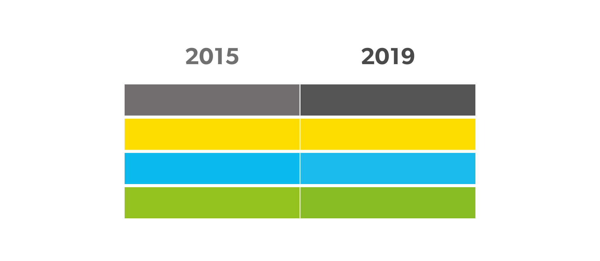
Our brand grey is now darker, which reflects our increased authority in our industry. Our colours are ever so slightly stronger, to emphasise our increased confidence in our creative ability. We have also dropped the green from the icon. Having three colours next to each other in the previous logo was diluting the strength of any one of them when it was shown at smaller sizes. So we’ve simplified. We will, however, use it in other places in our broader palette. Here is a comparison between the two:

Typography
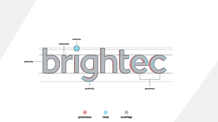
Our logo’s letterforms are now more uniformed in shape. The curves and interior spaces reflect each other more than they used to. Heights and widths of some letters have also been honed with our brand phrases in mind. Here is a comparison between the two:
Icon
Our icon has moved out of the word itself. This allows us to use the logo in multiple formats. It gives the wordmark more identity of its own, and it allows the icon shape more freedom by moving away from the ‘i’ position. The shape itself reflects our growing influence amongst our community and the clients we work with. Here is a comparison between the two:
Brand values
You may be wondering what the brand language was that I referred to earlier. Here are our core beliefs as a company, and how they have affected this redesign.
- “Making Things Better”
Our logo was already good, so the pursuit of this re-design is in itself proof of this belief in our company. Each element has been scrutinised against the notable changes in our company over the four years since the previous logo was designed. The new logo is a better reflection of our current company and our company direction than the previous one (which brilliantly reflected where we were at four years ago when it was designed).
- “Open For Business”
One of the goals of the new logo was to appeal to larger, more established clients. It needs to communicate that we are open for business to these companies. We are a safe pair of hands for these companies to trust with their products.
- “Freedom To Create”
Whilst we want to communicate an increase in maturity and expertise, we do not want this to come across as dull or boring. We still believe in a culture which offers the freedom to create. We approach large projects with creativity and an open mind. Our brand colours and icon are key to communicating this in the new logo.
- “Happy & Profitable”
Through lots of changes, growth and maturity, our team has remained happy and profitable. This belief is most clearly communicated in our office culture, and perhaps is something that can only truly be experienced in person. However, the rounded shapes in the letterforms of the logo, along with the circle and curve of the icon, are key to communicating this to those people who have not met us yet.
- “Collective Responsibility”
There is a real emphasis on the team at Brightec. We are not just individuals. Our successes and failures belong to each other, there is clear collective responsibility. When redesigning the logo, each letterform was minutely tweaked in order to create a better sense of uniformity between them, without removing their individual characteristics. Every detail matters when communicating our expertise to those around us.
So there you have it, our new logo and associated visual updates. We’re excited to see how it serves us in the coming years!
Looking for something else?
Search over 450 blog posts from our team
Want to hear more?
Subscribe to our monthly digest of blogs to stay in the loop and come with us on our journey to make things better!
