Is there a simple way to make complex product decisions?

A simple, effective approach to mastering complex product decisions.
In this blog I’m going to share some simple, visual ways to make complex decisions. You’ll be able to take these examples and apply them to your own context, regardless of what sector, scale or lifestage your product is currently in.
If you’re like me, then you’ll agree that it can be really hard to look at a simple, vertical list and make an informed decision on which items are the most important, valuable, time-sensitive etc.
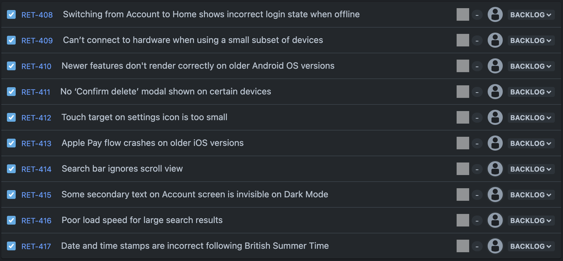
Whilst there are many places where a list is the best tool you could choose, I have found that a list is too simplistic for many product management decisions. A one dimensional line where something is either higher or lower than something else. It doesn’t always visualise the multiple factors that I need to consider when making a decision. Let’s use a hypothetical list of bugs which need fixing on an app, as an example:

This list does some things well. At a glance I can see the name of all the bugs that need fixing, in one simple place and in one simple order. In this case, the list is also on JIRA, which means once I’ve made my decision, the team can manage the issue through to completion on their project board.
But there are key pieces of information that I can’t see from this view:
I can’t tell by looking at the list which issues are having the most severe impact on the user’s experience of the product.
I can’t tell how frequently each bug occurs for the user.
Enter the (Prioritisation) Matrix
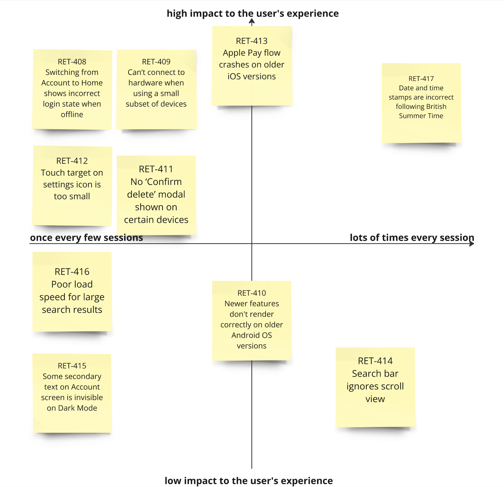
I will often use a prioritisation matrix to help me prioritise a list. In the example below, you can immediately see how those same bugs are plotted against impact and frequency.

Now I can immediately see the most impactful issues are in the top right quadrant. I’ve also kept reference to the JIRA ticket number so that I can refer a decision back to the development team. Using this view you can see how much easier it is to make a decision about what to include in the next app update. I might choose to tackle RET-417 and RET-413 quickly, then plan to do RET-409, RET-411 and/or RET-410 and RET-414, in a followup version. I can confidently leave the rest for a future version update, to be re-prioritised against the emergent issues at that time in the future.
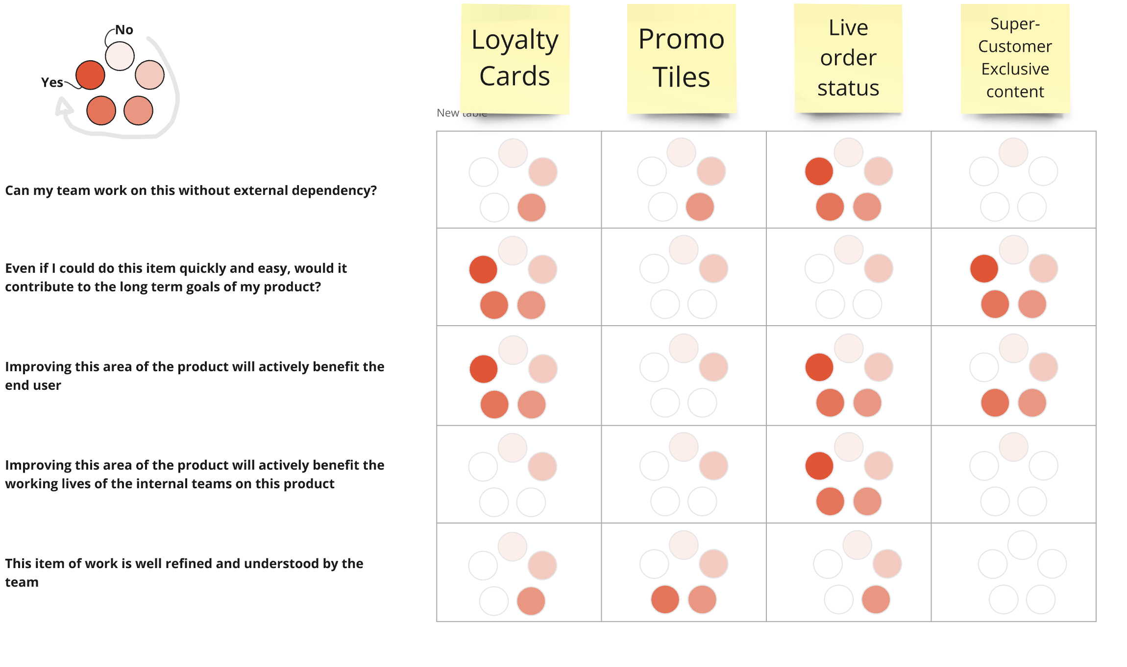
This isn’t a groundbreaking new idea, it's been around for decades. The key is in how flexible this concept is. You can bend it to suit whatever decision point you want to make. Below is an example which takes things one or two steps further. It gets nice and creative with the concept of visual mapping. Here we’re no longer looking at bugs, but a hypothetical set of potential new features to consider.

I’ve been in scenarios like the above when I need to make a decision based on 20+ factors:
Does this idea depend on another team which I know are busy within this time period?
How can I judge the impact this would have on an internal team vs the impact it would have for an external user?
Does this idea have obvious short-term gain but not actually align with the long term strategy of this project?
This item is ready to go, but doesn’t hold much value, whereas this item is not at all refined yet would have lots of value if we delivered it.
etc.
Using this principle of visual mapping, you can begin to answer these questions in a more confident and holistic way.
Am I over-complicating a simple product decision?
Of course, some decisions are more simple and obvious. These should not be dragged through a mapping exercise. For those decisions, this would be an unnecessary over-complication.
However, for many decision points, I’ve found that the product I am managing (alongside or on behalf of my clients and customers) cannot afford for me to over-simplify my decision making process.
There’s no silver bullet to conquer every potential product management decision, but understanding this visual matrix concept has helped me time and time again to make better product decisions.
If you’re reading this thinking to yourself, “this isn’t concrete enough, I want a system that gives me some cold, hard metrics and formulas to base my decisions on!” - well don’t worry, this same concept works with numbers in spreadsheet form. Sometimes this is called a scoring system. I have clients who use a system like this, and it works really well when presenting would-be changes to a much larger team or to a financially minded decision-maker who understandably wants to see some due diligence before approving further investment, etc. I have written about a version of this in a previous blog.
Neither the formulaic metrics system nor the visual, mapping matrix is universally more appropriate to use. You’ll need to find the best version of this for your situation based on the specifics of your project.
If you want to read more about how to gate-keep the list of ideas in the first place, I’ve written about that in this blog, which talks about asking the right questions from the start.
Looking for something else?
Search over 450 blog posts from our team
Want to hear more?
Subscribe to our monthly digest of blogs to stay in the loop and come with us on our journey to make things better!
