


One layout to rule them all

A brief history of layouts
I remember designing for the 3.5 inch iPhone whilst my Android mates were straining every dev sinew to fit their layouts to all the Android devices. The absolute worst case scenario was that we’d need to design a mere two layouts; one for portrait and one for landscape modes. Simple.
Then things began to change...
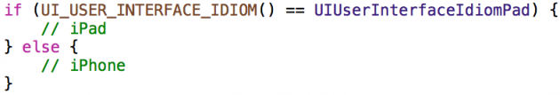
Apple launched the iPad and all of sudden building our layouts started to feel a little clumsy. Now we could build it through code using the user interface idiom checking, like so:
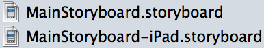
Or by creating two different storyboards or xibs, for both iPhone and iPad.
Normally we used different layouts for iPhone and iPad, e.g. in iPad we could set different outlets like UISplitViewController, so we started to think in different designs for iPhone and iPad.
Panic stations
Then the 4 inch iPhone appeared. Panic set in. Now we had to think in three different layouts: iPhone 3.5’’, iPhone 4’’ and iPad
Of course, if you wanted to develop in both portrait and landscape orientations you'd need six different layouts. Good grief.
Auto layout
Thankfully, Apple surprised us with AutoLayout. It promised to simplify the way to layout for all screen sizes.
At the beginning I found AutoLayout quite unintuitive. It was hard to stop thinking in frames and to start to think in margins! Moreover, you still needed to create two different layouts; for iPhone and iPad.
I often wondered what we would do if Apple created yet another device with another screen size. A third layout would surely stretch us to breaking point...
Ever increasing iPhones
Bringing the story right up to date; Apple has now introduced the new iPhone 6 and iPhone 6 plus, which famously have two brand new screen sizes. Fortunately for us developers, they’ve also introduced a new way to set the different layouts: adaptive layouts and size classes.
Adaptive layouts
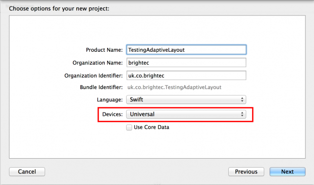
Designing for individual form factors simply isn’t scalable, so instead a more abstract layout based on relationships between the various UI elements is needed. With universal storyboards and size classes, we only need to create one main layout and simply adapt the size classes to any device with any screen size or orientation.
The same storyboard can now be used for both iPads and iPhones running iOS 8. There is now no need to keep per-device storyboards in sync with each other. You only need to specify in the project settings that your project will use universal devices and the project will include a single storyboard. We only need to set the outlets on this layout and test the results on different devices.
Universal storyboards are great – but we've already discovered that creating one single layout for all displays is a bit of a challenge. However, Adaptive Layout has a few more tools and tricks to solve these issues.
Size classes
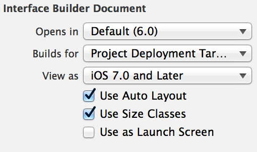
One of the core concepts behind adaptive layout is size classes. A size class is a property applied to any view or view controller that represents the amount of content that can be displayed in a given horizontal or vertical dimension. In a storyboard the size classes option is activated by default, but if you work with nibs you probably have to tick it in the file inspector option.
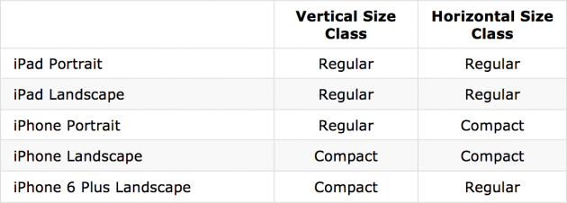
Xcode 6 provides two size classes: regular and compact. Although they are related to the physical dimensions of a view, they also represent the semantic size of the view. Now we have two different size classes according to the different devices and orientations: regular and compact.
So the aim is to set all the outlets and constraints in the base layout and do the required changes to fit all the layouts. Clicking on w Any h Any in the bottom bar in the interface builder will show the size class selector as shown below:
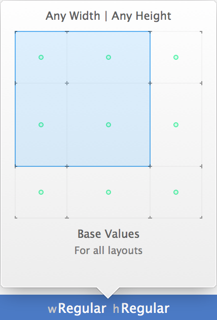
Firstly, you should work on the base layout and then after that adjust each one of the nine screen sizes. Now if you delete a constraint, you are only deleting it in the current size class. This allows you to change the constraints in the same layout. If you look closely in the size inspector and you delete a constraint, you will realise that you are actually deleting from this size class, but the constraint is still appearing in the all sizes tab.
Note:
Before we finish it's worth mentioning that as far as we know, the size classes are being applied on viewDidAppear. So before that, the app will be using the base layout, keeping that squared screen size. Keep this in mind in case you want to change any of the layout programmatically!
This article was originally written for Brightec by Jose Martinez
Looking for something else?
Search over 450 blog posts from our team
Want to hear more?
Subscribe to our monthly digest of blogs to stay in the loop and come with us on our journey to make things better!
