


How We Created a Custom Slider with Marks for iOS

Sliders are a convenient and easy-to-use iOS feature that most of us are familiar with. According to Apple’s Developer Guidelines, “A slider is a horizontal track with a control, called a thumb, that people can adjust between a minimum and maximum value.”
Despite the convenience they offer to users, custom sliders can often be difficult for users to manipulate. Without proper development, it can be difficult for users to select an exact value - especially on touch interfaces.
But here at Brightec, we like a challenge! So, when a client approached us with a request to create a custom slider for iOS we couldn’t wait to get started!
Custom Sliders Built by Brightec: The Project
We recently had a client approach us with a request to create a custom slider for a music player. We’ve built many sliders for clients and are confident in creating custom sliders with smooth functionality and ease-of-use.
However, the problem came to light when we were asked to set a number of marks on a music player slider.
Creating an iOS Custom Slider with Marks: The Challenge
Most weeks, most days actually, we stumble across various setbacks and challenges (sometimes at first seemingly insurmountable) in the process of app development. It’s all part of the process.
The music player design we were after was similar to the UISlider component of iOS. However, the problem came to light when we needed to set a number of marks on the player to show the user where each track of that session started.
Here’s how we overcame the challenge of creating an iOS slider with marks.

Customising the Slider’s Appearance
We began our research and soon discovered that the UISlider iOS component doesn’t allow you to do this, and sadly the only possible customisation for this component was as follows (extract from Apple docs):
“The most common way to customize the slider’s appearance is to provide custom minimum and maximum value images. These images sit at either end of the slider control and indicate which value that end of the slider represents. For example, a slider used to control volume might display a small speaker with no sound waves emanating from it for the minimum value and display a large speaker with many sound waves emanating from it for the maximum value.
The bar on which the thumb rides is referred to as the slider’s track. Slider controls draw the track using two distinct images, which are customizable. The region between the thumb and the end of the track associated with the slider’s minimum value is drawn using the minimum track image. The region between the thumb and the end of the track associated with the slider’s maximum value is drawn using the maximum track image.
Different track images are used in order to provide context as to which end contains the minimum value. For example, the minimum track image typically contains a blue highlight while the maximum track image contains a white highlight. You can assign different tint colors for all of the standard parts provided by the slider, or you customize the appearance further by assigning different pairs of track images to each of the control states of the slider.
Assigning different images to each state lets you customize the appearance of the slider when it is enabled, disabled, highlighted, and so on. In addition to customizing the track images, you can also customize the appearance of the thumb itself. Like the track images, you can assign different thumb images to each control state of the slider.”
Thanks for that, Apple.
Apparently, this customisation didn't help us to set the marks. However, not to be deterred, we put our thinking caps on (the boss recently bought us new ones) and came up with a few solutions.
Setting the Marks Utilising UIView Instead of UISlider
First off - how about we utilise UIView instead of UISlider? We could set an UIView for the thumb, and two images for the selected side and unselected. With a pan gesture recognizer in the thumb we could move it along the x-axis, allowing us to hide and show the two views behind respectively.
However, this solution required a lot of work and we thought there might be simpler and cleaner solutions.
Setting Custom Slider Marks with CoreGraphics
Or, maybe - use a UISlider and set the marks with CoreGraphics inside fixed height and width images (for selected and unselected sides) and use the method colorWithPattern to dynamically fill the slider bar. The trick was to not reuse the pattern by setting an UIImage with the slider width.
However, we couldn’t easily change the bar height without pixelating it. Moreover, it wasn’t a clean solution (which is always important).
[self.slider setMinimumTrackTintColor:[UIColor colorWithPatternImage:[UIImage imageNamed:@"SelectedSide"]]];
[self.slider setMaximumTrackTintColor:[UIColor colorWithPatternImage:[UIImage imageNamed:@"UnselectedSide"]]];
How about… similar to the second solution, but now using SetMinimumTrackImage: forState: and SetMaximumTrackImage: forState: methods. However, sadly the image was being stretched whenever we moved the thumb.

Setting the UIImage as Resizable
Finally, we struck gold with a solution very similar to the third idea above. We only needed to set the UIImage as a resizable image with the following method: resizableImageWithCapInsets:UIEdgeInsetsZero.
At last, the image stayed static while we moved the thumb!
Creating a Reusable iOS Custom Slider
Of course, for any app developer, once you’ve cracked the code (and not just metaphorically) another problem soon arises. We now had a resizable player but it wasn’t quite reusable yet! So, we turned it into a reusable component by doing the following:
- We created a subclass of UISlider in order to put all the code together and make it reusable.
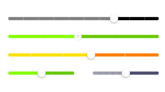
- We created properties to customise some elements of the slider; like the width and colour of the marks, the colour of the selected and unselected sides bar, and even the colour of the thumb or the possibility to set an image.
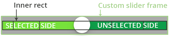
- We created all the processes with CoreGraphics; firstly, by setting an inner rectangle frame to draw the lines and the selected and unselected sides bar. We made this by getting the mid y-axis point of that rectangle and drawing a line with rounded line cap and fixed width.
Now the slider is fully reusable. Job done.
View Our Custom Slider
If you’d like to see our slider in action, you can view it on GitHub and CocoaPods.
For more projects like this one, check out our portfolio. You can also find invaluable advice from our developers on our blog.
This article was originally written for Brightec by Jose Martinez.
Looking for something else?
Search over 400 blog posts from our team
Want to hear more?
Subscribe to our monthly digest of blogs to stay in the loop and come with us on our journey to make things better!
