


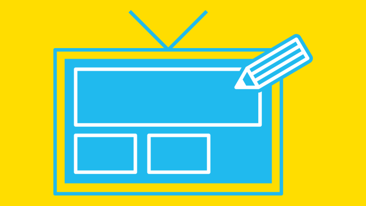
TV App Design Basics
First steps
If (like me and most designers at present) you have little or no experience in TV app design, the first thing you'll probably do is head straight to the design guidelines.
There you'll find that amongst all the usual fluff that Apple and Google like to pad out their guidelines with, it can be quite hard to find the things that you really need...
For instance, how can I set up a Sketch file so that I can design for TV? What size should all my various icons be? How many versions of these icons do the development team need?
Whilst you might find some of the answers if you dig deep enough in the general guidelines, I thought I’d compile a list of the things that I've found practically helpful so far.
Typography
Use the relevant system fonts across different TV apps. With them, I found that text is easily legible at the following sizes (assuming the colour choice is right):
- For the Apple TV we used 36pt for headers and 24pt for body.
- For AndroidTV & Amazon Fire TV we used 66sp for card headers and 28sp for card body.
As with mobile, I would suggest using the system font unless, of course, the client has a very particular typeface that is central to an element of their branding.
Image assests
If the app you are creating is heavily reliant on imagery, as most TV apps will be, it's important to upload the right size file for each instance of an image.
If (like me) you’re in the habit of designing for mobile, you’ll be used to exporting multiple versions of an asset for iOS. However with tvOS, only a 1x version is needed. So you needn’t worry about the @2x & @3x versions.
Android TV does still need all the drawable folders for a lot of its assets. Given this easy to use Sketch plugin, its still quicker to export every asset in every size.
Image positions
Just as with mobile design, TV app’s can use the same asset in multiple places. With this in mind it’s worth double checking that the image or icon you’ve created will work in all the positions it could find itself in.
An example of this for icons would be that in Android TV your app needs a version of its icon that can be displayed on the home screen, if the user exits your app whilst playing content.
If your app’s main icon is simply the logotype of the client, you might want to consider if the logotype will work at the smaller size, or whether you should replace it with a new icon.
Similarly for images, the system that we used to build the FruitMedia TV app used the same image in multiple places. Whereas in a rectangular card view your image might be perfectly composed, if it is cropped to a square in a preview mode it could lose its impact. This is worth considering when setting your imagery.
Sketch template & naming conventions
If you’d like a copy of the template Sketch file I’ve created, please get in contact.
Admittedly it is fairly basic at the moment, but I’ve separated all the elements I needed into their own artboard for ease of explanation, so use it how you want.
So there you go, very basic stuff I know, but it might help save you some time if you’re starting out on some new TV app projects.
Looking for something else?
Search over 450 blog posts from our team
Want to hear more?
Subscribe to our monthly digest of blogs to stay in the loop and come with us on our journey to make things better!
