


How should dark modes be designed for mobile apps?
And, a lesson in why you should name everything semantically
It’s becoming more apparent that many people expect a dark mode option from their mobile apps. At Brightec we’ve been exploring the best ways of setting this up for design and development. How do you go about doing this in existing projects which weren’t originally designed to be themed?
Come to the Dark Side
The world of smartphone users is split into three groups. One group who use the default light mode, one group who prefer dark mode and one group who don’t even know they have the option to switch modes at all. Having a job that requires constantly looking at either a laptop or smartphone, I am firmly in the dark mode camp - but I know this isn’t everyone’s preference.
Designing with semantic naming conventions
Originally used for CSS classes in web development but now also used more widely for mobile apps, semantic naming is a way of naming components that ‘describe[s] their intentions and [makes them] adaptive as well’1. This could be something like defining a button colour as button rather than an ambiguous colour called orange (which may be used elsewhere, not on a button). With the button example, if you’ve defined different themes, the button text and background colour should change depending on the theme - for example if the default button style is white with dark blue text, you’d probably want to have a dark mode style.
We’ve recently been working to create a dark mode theme on a feature for one of our existing apps. and have learned some hard, fast lessons on why semantically naming styles and colours is essential. Older projects often tend to be created and organised in a different way to if they were made today. Our early colour naming conventions were based around the different shades of colours (e.g. blueLight, blueNormal, blueDark etc). This was ok when there was no theme for the app, but we ran into difficulty when trying to create a dark mode.
To resolve our problem, we started by mapping every colour in the default palette to its own dark mode counterpart. Because many of the colours were used multiple times in different contexts, the UI didn’t look right once dark mode was enabled. For example, the original nav colour was blueNormal, and this was also the colour of various buttons, icons and borders. Furthermore, there were colours in the app that weren’t defined at all. This meant we had to go through the code to assign a defined colour from the palette to every instance. Now we were at a point where all the colours were defined, but there were still lots of instances of repeated colours that no longer worked - mostly due to lack of contrast.
Cue semantic naming! We went through the design files and code and defined colours based on their usage, rather than the shades themselves. For example, instead of the nav colour being greyDarkest in dark mode, it now has its own specific colour. This is really useful because it means if you choose to have a different component in the same colour, then down the line decide to change one component and not the other, the colour is no longer a global style applying to everything in that hex code. Equally it means that switching between themes is seamless; the default blue nav colour changing from blueNormal to nav easily switches to its dark mode counterpart without altering other components which are also that particular blue.
Design System theming
When starting a new Sketch project, it's always good to create a Sketch Library associated with the project. Although you can add local styles, it’s better practice to use the Library because it allows future files to be added under the same umbrella project (e.g. a client who wants a new product with the same branding). This way, if the client changes one of their brand colours, you can just update the library and the style will change globally.
Within the Library you can define colours for different themes really easily, both in terms of layer styles but also Sketch’s colour variables With Sketch Libraries, you can effectively create a design system - not just with colours but also component styles, icons and typography. When it comes to theming, this makes life easier as the styles have already been defined- so it takes no time at all to quickly make different artboards to showcase the different themes.
So you just invert all the colours, right?
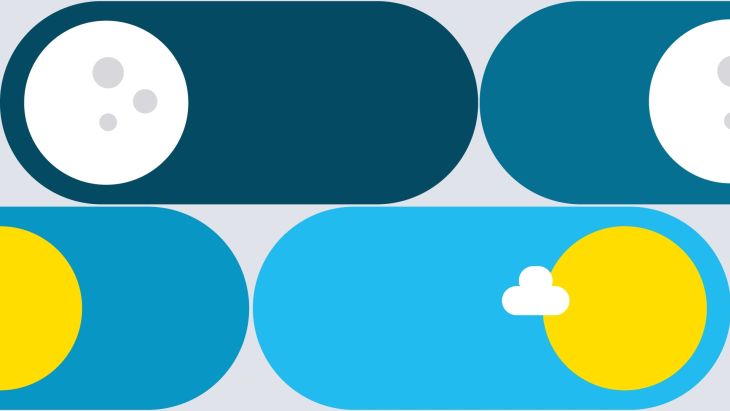
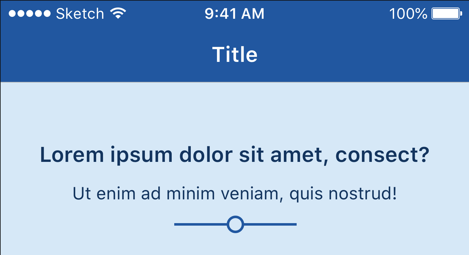
Please, no! Sometimes that does work, lots of the time it doesn’t. Choosing colours for your dark mode is not as simple as just making everything that was white now black. If your light mode app has a base colour running throughout the app, it’s good to suggest that in the dark mode. For example, the app we’ve been working on has a few backgrounds of this light blue colour:
Initially for the dark mode, we wanted the background to be dark, and the nav to be another shade of dark grey. However, we realised that this lost a lot of the brand’s personality, so we chose to use 2 different dark shades of the blue instead:
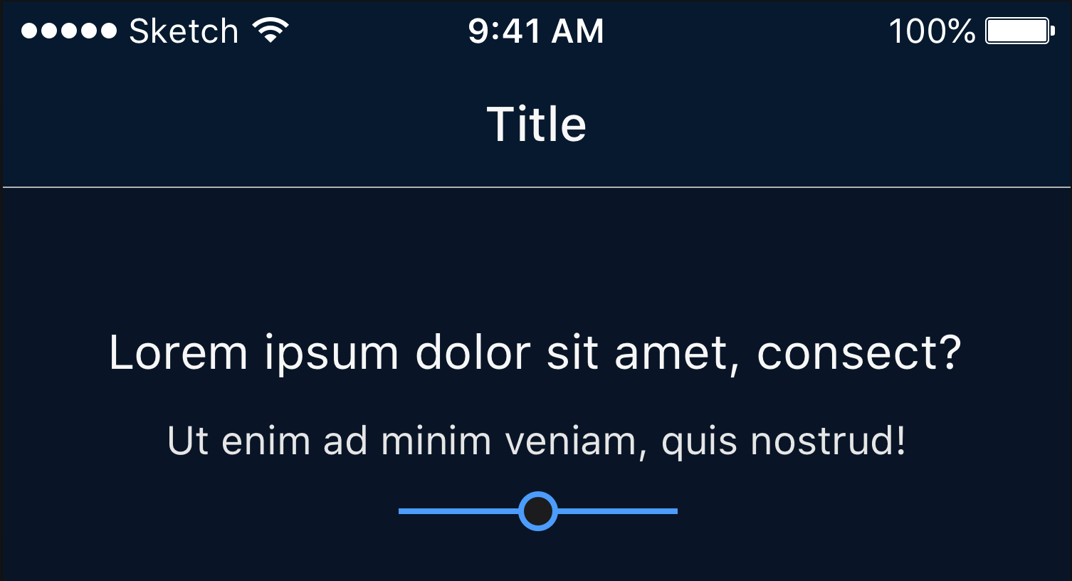
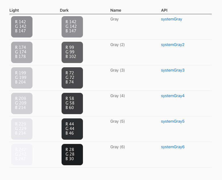
This meant that the app would still retain some of its characteristic blue, without sacrificing the all-important contrast ratio between the text and background. It’s generally agreed that backgrounds shouldn’t be pure black (i.e. #000000) for dark mode, especially not with pure white (#ffffff) text. Over at Apple’s Human Interface Guidelines, they show a template of how different colours can be themed:
Google’s Material Guidelines also is a really good resource for finding their suggestions for implementing dark mode.
Full Sith mode
Dark mode is good for several reasons: (not just because we’re huge Star Wars fans) it’s less straining on your eyes, and it conserves the battery life of your devices2. Not only this, but dark mode apps can be visually really interesting and attractive! Whether you like it or not, dark mode isn’t going anywhere. If you’ve never tried it out on your own device before, I’d highly recommend giving it a go.
Looking for something else?
Search over 450 blog posts from our team
Want to hear more?
Subscribe to our monthly digest of blogs to stay in the loop and come with us on our journey to make things better!
