Spotify v Apple Music

Good green or bad green?
We’re fast approaching the first anniversary of Apple Music - it was launched at WWDC in June last year.
It was a bold move for Apple, as they tried to regain their leading position in the music market that they’d lost since the early age of the iPod.
At the time, much commentary focused on the effects on the other main players in the marketplace, mainly Spotify. Would it kill off their dominance in the streaming market? Surely with the funds, hardware and brand power that Apple held, they could sweep aside any competition?
The announcement of the capture from the BBC of Zane Lowe (as he moved to Beats1) signalled Apple’s intent.
So, with bated breath, we watched and waited. How would Spotify respond?
They went green (really green)
Obviously, their brand was green before (remember?) but this was perhaps the most talked about green-to-green change, since, well… ever.
Twitter was not happy:


It seemed like the entire internet shook its head in disapproval. Apple had Apple Music, Beats1 and Zane Lowe. While Spotify, in response, looked like they’d had a bad night out at Fukushima.
Green light to a design war
Initially, I joined the worldwide chorus of malcontent.

However within a matter of days, my tune changed.

Not only was I won over, but I realised this new green was the ‘green light’ to a new design war.
Apple Music & Spotify were now facing off, mano a mano, armed with a bunch of high-grade, nuclear UX weapons. It’s on people!
In the green corner - Spotify
With their change to a bolder, richer green, they made a statement that they were the brightest, best looking streaming app in the store.
They would not watch on passively as Apple Music stole users from their old, muted and outdated UI.
In the ‘mishmash’ corner - Apple Music.
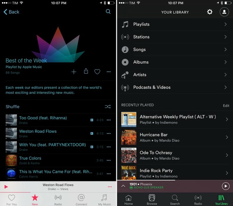
Their colour predominantly comes from the album artwork itself. Not a bad idea in principle, in fact, it’s quite a deliberate attempt to help market itself as ‘putting the music first’.
However in practice, this lack of a uniform colour can often lead to conflicting colour schemes as you scroll through the app.
Because they’ve decided to use the artist’s colours, it is tricky for them to use their own colours to point users to interactive elements on the screen.
The red in their tab and nav bars is about as far as they can realistically take their colour. They can’t put their colour on top of the artist colour because the artist colour is out of their control.
All quiet on the typography front?
The battle has raged on since, and multiple UX/UI fronts have opened.
Spotify & Circular
Spotify recently adopted a new typeface, ‘Circular’. It does what it says on the tin (well, app… you know what we mean).
Circular has brought Spotify further down the friendly design route.
It both successfully communicates their human appeal and helps mark them out as individual compared to the corporate giants of Apple. Something that their previous font (an adaptation of the Gotham family) was not doing.
No change at Apple
Apple, on the other hand, decided to stick with their system font for their Music app. While this might achieve a degree of brand strengthening across the rest of their systems, it seems far too corporate and business-like for an app that supposedly celebrates the individual's taste in music.
Of course, there’s the occasional example of ultra kerning, but this is little more than a design trend that’s going to disappear around the corner in the not too distant future (bad pun intended).
For a moment, imagine taking away colour and imagery from both apps: Apple Music might be mistaken for a utilities app whereas Spotify could still sit comfortably in the creative market.
For whom the (navigation) bell tolls
Of course, on our design battlefield, navigation is of utmost importance.
And frustratingly, both apps have their navigational niggles.
Apple Music's navigation
The tab bar at the bottom of the screen is one of Apple’s top recommended methods of navigation.
It allows users to move around the various areas of an app quickly and easily. And on the larger devices, it’s nice and close to your thumb.
The problem is, looking at Apple Music’s tab bar, the icons are some of the least relevant icons to the content that I’ve ever seen.
The ‘Connect’ area of the app was heralded as one of the flagship features of Apple Music, supposedly allowing listeners and artists to ‘connect’.
Sounds great! But what’s the ‘@’ icon about? Is it just a means to tweet the artist? Is it a hint to an email address? If this section was supposed to be personal and all about human listeners interacting with human artists, how does the ‘@’ communicate this?
Call me old fashioned but it communicates distance to me, not interaction.
The star for ‘New’ (as in New Music) would’ve made more sense as an icon for a Charts feature. Most newly released music doesn’t chart, unless you’re already a big artist (which coincidentally, all the artists in the ‘collection of the world’s most exciting and interesting new music’ shown below, already are…)

Spotify’s navigation
Up until recently, they’ve been using a burger menu in the top left. It goes without saying that this was becoming the bugbear of music listeners everywhere.
It was confusing as to where you were in the app, it took ages to get back to the root of each section and it was a work out for the thumb to reach it.
But they’ve recently moved back the tab bar. Just like Apple Music. Copycats? Maybe.
But in my opinion, they’ve nailed it. I know what’s going to be housed in every section before I tap. The iconography has perfectly fulfilled its primary purpose of communication.
If I was to pick a hole in it, the ‘Browse’ icon is probably 2px too big because it’s a largely filled shape, whereas the others are largely hollow.
A new design at WWDC?
In summary, it’s fair to say that Spotify is better designed and, despite the attempted market takeover by Apple Music, it is still the clear market leader. You can’t argue with the fact that it has 19 million more users than Apple Music.
However, Apple aren't finished yet, as the internet is littered with rumours that they’ll be relaunching their app with a new updated design at this year’s WWDC in June.
Stay tuned, it seems like Round 2 of this battle will be starting shortly!
Looking for something else?
Search over 450 blog posts from our team
Want to hear more?
Subscribe to our monthly digest of blogs to stay in the loop and come with us on our journey to make things better!
