


Custom borders in SwiftUI: a step by step process

While working on a recent app, I encountered a fun design challenge that required some creative thinking. Here's how I created some custom borders.
The app's onboarding process consisted of four steps, each displayed within a card-style view on the screen. To visually indicate progress, the design called for a border to be drawn around the card—one edge at a time—with each onboarding step. To add a bit of flair, the border needed to be animated, appearing as though it were being physically drawn from corner to corner. As a further twist, the card featured rounded corners, so each side of the border had to start and end precisely at the midpoint of those curves. Oh, and each edge had to be a different colour. And naturally, the card wasn’t a fixed size, so the border had to adapt dynamically to any dimensions. Just your typical "simple" border, right?
Thankfully, this was a custom border tailored specifically for a rectangular view with exactly four steps—no need to account for other shapes or varying numbers of steps.
Step 1: Create a custom ViewModifier
The first thing I did was to create a custom ViewModifier that would handle the border drawing animation. The modifier takes four boolean bindings to control the visibility of each edge of the border. Each edge would be drawn with a different colour to make the progress more visually distinct. Here's how we started:
struct BorderedViewModifier: ViewModifier {
    @Binding var showTop: Bool
    @Binding var showTrailing: Bool
    @Binding var showBottom: Bool
    @Binding var showLeading: Bool

    private let baseColor: Color = .mint
    private let topColor: Color = .red
    private let trailingColor: Color = .yellow
    private let bottomColor: Color = .blue
    private let leadingColor: Color = .green
    private let animation: Animation = .linear(duration: 0.6).delay(0.3)
}
Step 2: Create a custom Shape
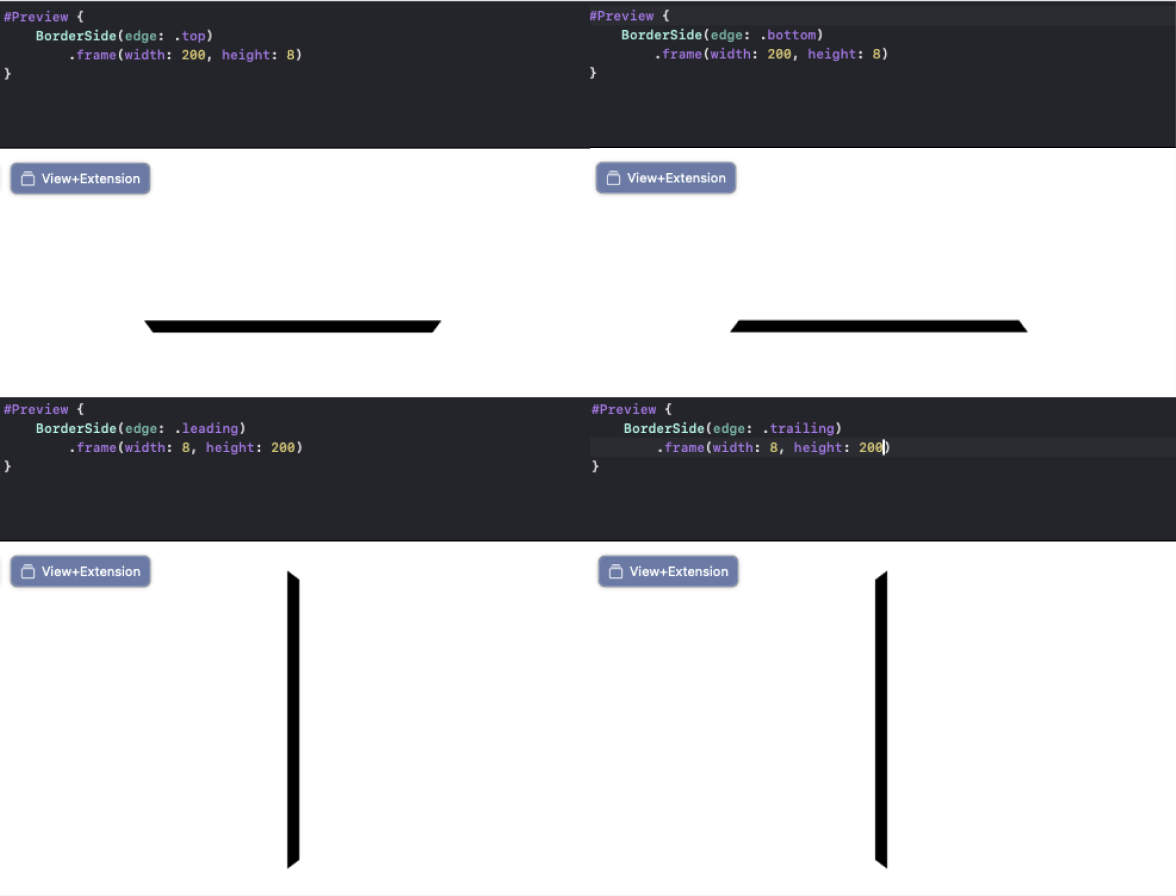
The key to making this work was creating a custom Shape that would draw each edge of the border. The BorderSide shape is designed to draw a trapezoid shape for each edge, which creates the illusion of a border being drawn. The shape takes an Edge parameter to determine which side it's drawing and adjusts its path accordingly:
struct BorderSide: Shape {
    let width: CGFloat = 6
    let edge: Edge

    func path(in rect: CGRect) -> Path {
        var path = Path()

        switch edge {
        case .top:
            path.move(to: CGPoint(x: 0, y: rect.minY))
            path.addLine(to: CGPoint(x: rect.maxX, y: rect.minY))
            path.addLine(to: CGPoint(x: rect.maxX - width, y: rect.maxY))
            path.addLine(to: CGPoint(x: width, y: rect.maxY))
            path.addLine(to: CGPoint(x: 0, y: rect.minY))
        case .bottom:
            path.move(to: CGPoint(x: width, y: rect.minY))
            path.addLine(to: CGPoint(x: rect.maxX - width, y: rect.minY))
            path.addLine(to: CGPoint(x: rect.maxX, y: rect.maxY))
            path.addLine(to: CGPoint(x: 0, y: rect.maxY))
            path.addLine(to: CGPoint(x: width, y: rect.minY))
        case .leading:
            path.move(to: CGPoint(x: 0, y: rect.minY))
            path.addLine(to: CGPoint(x: rect.maxX, y: rect.minY + width))
            path.addLine(to: CGPoint(x: rect.maxX, y: rect.maxY - width))
            path.addLine(to: CGPoint(x: 0, y: rect.maxY))
            path.addLine(to: CGPoint(x: 0, y: rect.minY))
        case .trailing:
            path.move(to: CGPoint(x: 0, y: rect.minY + width))
            path.addLine(to: CGPoint(x: rect.maxX, y: rect.minY))
            path.addLine(to: CGPoint(x: rect.maxX, y: rect.maxY))
            path.addLine(to: CGPoint(x: 0, y: rect.maxY - width))
            path.addLine(to: CGPoint(x: 0, y: rect.minY + width))
        }

        return path
    }
}
Here we can see what the BorderSide trapezoids look like for each edge:
Step 3: Create a ZStack
The ViewModifier then uses a GeometryReader to get the exact dimensions of the content view and creates a ZStack with four BorderSide views, one for each edge. Each edge is wrapped in its own ZStack that contains both the base color (shown when the edge is not yet active) and the coloured version that animates when the corresponding boolean binding becomes true. The animation is handled by animating the frame width or height of each edge from 0 to the full size:
func body(content: Content) -> some View {
    VStack(spacing: 0) {
        content
            .padding(5)
            .cornerRadius(4)
    }
    .background(
        GeometryReader { geometry in
            ZStack {
                VStack {
                    ZStack {
                        VStack(alignment: .leading) {
                            BorderSide(edge: .top)
                                .fill(baseColor)
                                .frame(width: geometry.size.width, height: 7)
                        }
                        .frame(maxWidth: .infinity, alignment: .leading)
                        VStack(alignment: .leading) {
                            BorderSide(edge: .top)
                                .fill(topColor)
                                .frame(width: showTop ? geometry.size.width : 0, height: 7)
                                .animation(animation, value: showTop)
                        }
                        .frame(maxWidth: .infinity, alignment: .leading)
                    }
                    Spacer()
                }
                HStack {
                    Spacer()
                    ZStack {
                        HStack(alignment: .top) {
                            BorderSide(edge: .trailing)
                                .fill(baseColor)
                                .frame(width: 7, height: geometry.size.height)
                        }
                        .frame(maxHeight: .infinity, alignment: .top)
                        HStack(alignment: .top) {
                            BorderSide(edge: .trailing)
                                .fill(trailingColor)
                                .frame(width: 7, height: showTrailing ? geometry.size.height : 0)
                                .animation(animation, value: showTrailing)
                        }
                        .frame(maxHeight: .infinity, alignment: .top)
                    }
                }

                VStack {
                    Spacer()
                    ZStack {
                        VStack(alignment: .trailing) {
                            BorderSide(edge: .bottom)
                                .fill(baseColor)
                                .frame(width: geometry.size.width, height: 7)
                        }
                        .frame(maxWidth: .infinity, alignment: .trailing)
                        VStack(alignment: .trailing) {
                            BorderSide(edge: .bottom)
                                .fill(bottomColor)
                                .frame(width: showBottom ? geometry.size.width : 0, height: 7)
                                .animation(animation, value: showBottom)
                        }
                        .frame(maxWidth: .infinity, alignment: .trailing)
                    }
                }
                HStack {
                    ZStack {
                        HStack(alignment: .bottom) {
                            BorderSide(edge: .leading)
                                .fill(baseColor)
                                .frame(width: 7, height: geometry.size.height)
                        }
                        .frame(maxHeight: .infinity, alignment: .bottom)
                        HStack(alignment: .bottom) {
                            BorderSide(edge: .leading)
                                .fill(leadingColor)
                                .frame(width: 7, height: showLeading ? geometry.size.height : 0)
                                .animation(animation, value: showLeading)
                        }
                        .frame(maxHeight: .infinity, alignment: .bottom)
                    }
                    Spacer()
                }
            }
            .cornerRadius(6)
        }
    )
}
The corner radius of the border is handled in two places. First, the entire border container (the ZStack containing all four BorderSide views) has a corner radius applied to it using the `.cornerRadius(6)` modifier. This creates the rounded outer corners of the border. The content view itself is wrapped in a VStack with padding and corner radius:
VStack(spacing: 0) {
    content
        .padding(5)
        .cornerRadius(4)
}
This creates the rounded inner corners that the BorderSide trapezoids connect to. The combination of these two corner radius values, along with the trapezoid shapes of the BorderSide views, creates a seamless border that follows the rounded corners of the content view.
Step 4: Create a View extension
To make this easy to use, we created a View extension that provides a convenient modifier method. This allows any view to use the custom border with a simple modifier call:
extension View {
    func borderedView(
        top: Binding<Bool> = .constant(true),
        trailing: Binding<Bool> = .constant(true),
        bottom: Binding<Bool> = .constant(true),
        leading: Binding<Bool> = .constant(true)
    ) -> some View {
        return modifier(BorderedViewModifier(
            showTop: top,
            showTrailing: trailing,
            showBottom: bottom,
            showLeading: leading
        ))
    }
}
Step 5: Create a state management class
The final piece was creating a state management class to handle the progress through the onboarding steps. The CardProgress class uses an enum to track the current step and updates the border visibility states accordingly. This makes it easy to control the border animation by simply calling next() or previous() on the progress object:
@Observable
class CardProgress {
    var showTop: Bool = false
    var showTrailing: Bool = false
    var showBottom: Bool = false
    var showLeading: Bool = false
    var currentStep: Step = .zero {
        didSet {
            switch currentStep {
            case .zero:
                showTop = false
                showTrailing = false
                showBottom = false
                showLeading = false
            case .one:
                showTop = true
                showTrailing = false
                showBottom = false
                showLeading = false
            case .two:
                showTop = true
                showTrailing = true
                showBottom = false
                showLeading = false
            case .three:
                showTop = true
                showTrailing = true
                showBottom = true
                showLeading = false
            case .four:
                showTop = true
                showTrailing = true
                showBottom = true
                showLeading = true
            }
        }
    }
    enum Step {
        case zero
        case one
        case two
        case three
        case four
        func next() -> Step {
            switch self {
            case .zero:
                return .one
            case .one:
                return .two
            case .two:
                return .three
            case .three:
                return .four
            case .four:
                return .four
            }
        }

        func previous() -> Step {
            switch self {
            case .zero:
                return .zero
            case .one:
                return .zero
            case .two:
                return .one
            case .three:
                return .two
            case .four:
                return .three
            }
        }
    }

    func next() {
        currentStep = currentStep.next()
    }

    func previous() {
        currentStep = currentStep.previous()
    }
}
Putting the borderedView extension together with the CardProgress state management we can apply this custom border to any view.
struct ContentView: View {
    @State private var progress = CardProgress()
    var body: some View {
        VStack {
            VStack {
                Image(systemName: "globe")
                    .imageScale(.large)
                    .foregroundStyle(.tint)
                    .padding()
                Text("Onboarding content")
                    .padding()
            }
            .frame(width: 300, height: 500)
            .background(
                RoundedRectangle(cornerRadius: 4)
                    .fill(Color.white)
            )
            .borderedView(
                top: $progress.showTop,
                trailing: $progress.showTrailing,
                bottom: $progress.showBottom,
                leading: $progress.showLeading
            )
            .padding()

            HStack {
                Button("Prev") {
                    progress.previous()
                }
                .buttonStyle(.bordered)
                .padding()
                Button("Next") {
                    progress.next()
                }
                .buttonStyle(.bordered)
                .padding()
            }
        }
    }
}
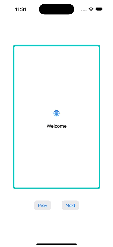
Here is how the border might look for an onboarding steps card:
There you have it—a custom, animated border solution for your SwiftUI views. While this particular implementation was tailored to a four-step onboarding card, the core principles of using ViewModifiers, custom Shapes, and state management can be adapted to create all sorts of unique visual effects in your apps. So, go forth, experiment, and bring some creative flair to your SwiftUI projects!
Looking for something else?
Search over 450 blog posts from our team
Want to hear more?
Subscribe to our monthly digest of blogs to stay in the loop and come with us on our journey to make things better!
