


How to use typography, touch targets and spacing for better accessibility

How can UX Designers optimise typography for accessibility?
So far in this series, we’ve looked at what accessibility is and how UX designers can optimise colour palettes to improve the in-app experience for users.
Typography is often intrinsic to a brand’s DNA. You’ll have a pretty solid idea about the right choice, layout, hierarchy and sizing of fonts. Check out the readability section on the Material Design website which goes into some very useful detail about type application. Remember not every additional need is a disability, and any clarity we can bring to our products to help those with diverse needs can only be a good thing.
Choice of font
Choosing a readable font is a key part of your choices around accessible design — Scope have a great in-depth article about choosing appropriate fonts. It’s well worth a read, but the main takeaways are:
Choose a font that is simple and familiar to users
Choose fonts with distinct characters
Avoid fonts with mirrored characters
Ensure sufficient spacing between characters (this can obviously be tweaked, but some fonts have more accessible spacing out the box)
Working with an established brand will likely find you adopting a pre-defined font or set of fonts. This can be fine, as most companies having undertaken a rebrand in the last decade will have considered the readability of their brand fonts.
However, if the brand fonts are causing a problem with legibility (for example, Brush Script being the only font in the brand guidelines) then you will need to work with your client to define a more legible font for use in their digital platforms.
What are the basics of text application for accessibility
Some specifics you will want to consider regards AA compliance for text use (from WCAG guidance):
Line height (line spacing) to at least 1.5 times the font size
Spacing following paragraphs to at least 2 times the font size
Letter spacing (tracking) to at least 0.12 times the font size
Word spacing to at least 0.16 times the font size.
Text scaling and device rotation
We’ve already discussed the use of colour for accessibility, but what about text scaling?
Many users choose to increase the size of the text in their mobile apps to make them easier to read (called Dynamic Type Sizes). As a team you need to consider how this is going to display when activated.
You really don’t want your page to break when this happens — text should still be readable, and the page navigable.
You’ll need to work with your developers to ensure text scales in a manageable and expected way. I suggest you design a large-text version of key pages/components to act as a guide.
Have rules around text over-spill in text fields — do they expand or does the text truncate?
The WCAG specify that apps must be viewable in both portrait and landscape formats, so you need to consider this too. By using margins and percentages, rather than fixed widths, your app will have a good chance of viewing well in both orientations. Some specific design will inevitably be required, and you’ll need to factor that in, in conjunction with your engineering team.
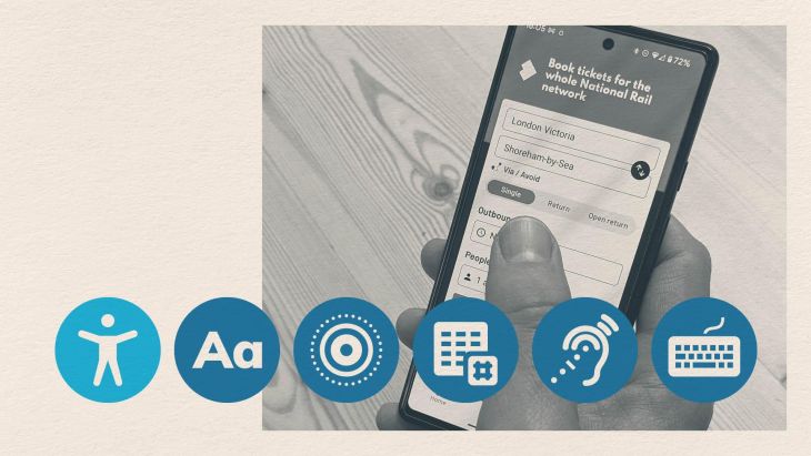
Using Alt-text to improve accessibility of mobile apps
What is alt-text?
Alternative text (or alt-text) is an invisible description for any image shown in a digital product. It is vitally important for anyone with a visual impairment, but can also help your SEO rankings, as web crawlers can recognise the content of your imagery.
How do I ensure the creation of alt-text is an integrated part of the design process?
If you’re working with a Content Designer, amazing — this one’s on them! If you’re not, this risks falling between the cracks. How might we reduce the risk of excluding alt-text? I suggest that you specify alt-text as part of the design brief and have a nominated person who owns the creation of the content. This nominated person could be you, but if you’re not super-confident with your writing ability, your Business Analyst is usually a pretty strong bet!
Find a sweet spot between lacking description and over-stuffing. For example; “Two people looking at a smartphone” would be described as bad alt-text as it doesn’t convey much information. “Two customers drinking coffee in a cafe, using a smartphone to compare prices of car insurance on the xxx website” would clearly be much more useful — it tells the user that the product is easy to access, that it is mobile friendly and it can be used anywhere. So, good for the business too.
If you’re using a handover tool then have the nominated person write the content in there, or in comments in Figma. Wherever is closest to the source of truth of the design files.
Pointers for using Alt-text I have listed some key takeaways from the Scope website which has some really useful guidance for writing strong alt-text.
Be specific and succinct — a benchmark for good alt-text length is around 125 characters
Describe information, not aesthetics
Think about the function of the image — leave alt-text empty for decorative images so as not to overload a screen-reader (ask yourself is this image actually bringing value? If the answer’s no, then it should be marked as decorative)
Don’t leave out important information — for complex images, provide further explanation elsewhere
Don’t rely on automatic alt-text generators!
Alt-text also applies to other non-text elements on the page, such as graphs and video content. Specific guidance is available through the WCAG as to what the requirements are for these. If in doubt, ask yourself this — can your page be understood without the requirement to see it?
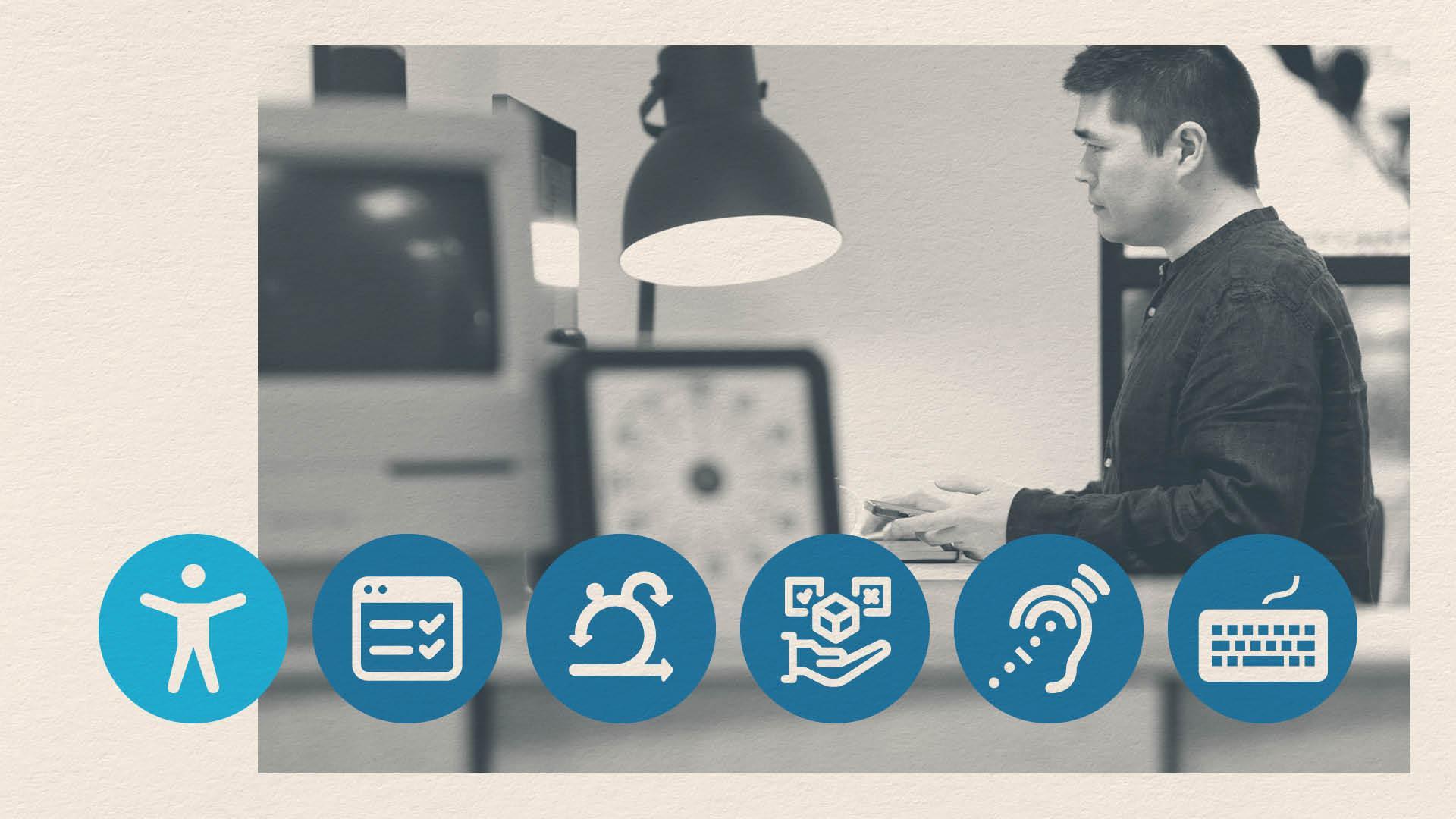
Touch targets and spacing considerations in UX design
Specifically, a touch target is the parts of the screen that respond to user input.
Standards around this were introduced as desktop websites started shrinking to fit mobile screens. Buttons which were fine when clicked with a mouse became way too small when our fingertips were now set the task of tapping them. Small buttons, often clustered too close together, created real navigational issues, especially for anyone with additional needs around mobility or hand-eye coordination.
The minimum size of your touch targets depends on the guidelines you follow — Material Design sets minimum at 48 x 48px, but WCAG at 44 x 44px — and applies to buttons and interactive graphics/components. It does not apply to linked text.
Some touch target pointers:
A touch target is a rectangular/square area, whatever shape your button/interaction is. ie, if you have a round button, the touch area around it will still be square.
For iOS, the recommended target is a little smaller at 44px.
It is recommended to have an 8px margin between interactive elements (or their touch targets).
A touch target can extend past the boundaries of the button/interaction if required. Ie, if your button is a 36px circle, the touch target would finish 6px outside the borders of the graphic to meet the required 48px.
If you’re working on a website, then the desktop ‘pointer size’ is smaller at 24px. Obviously if you’re building in 24px pointers onto a desktop size screen, you’d need to consider what happens to that element when scaling to mobile and the 44px requirement kicks in.
Navigation, spacing and layout considerations for accessibility
Touch targets and guidelines around spacing between them help us create app layouts optimised for anyone with accessibility needs.
They are, however, just one consideration around layout. Circling back to the main principles of Material design accessibility guidelines: Clear, Robust and Specific. Of these, Clear speaks directly into layout; “Help users navigate by designing clear layouts with distinct calls to action.”
Applying this to your app design, and building upon existing standards, means users are far less likely to struggle to navigate your app. Material Design have produced pages of content around layout best practice, which are worth understanding and applying consistently to your work. Some takeaways from this:
Be consistent
Understand and apply canonical standards
Do not crowd your design
Make CTAs and actions clear
You are probably already doing this, because you’re a good designer, but the WCAG states that consistency in navigation and titling on your page isn’t just best UX practice — it is a requirement*. (* Find out more about whether the European Accessibility Act and how it applies to your product)
Become familiar with the WCAG requirements around titling, labelling and relationships. Why not prepare a checklist that you ask yourself as you create your design system? A few to get you started:
Do I have a CTA leading to an internal page and a text link going to the same location?
Am I using different type styles to represent the same Heading style?*
Do my CTAs say ‘Read more’?
Keep reading for our guide on implementing and testing the accessibility of your app.
The role of a UX designer ensuring a good accessibility experience doesn’t stop at the development stage
Looking for something else?
Search over 450 blog posts from our team
Want to hear more?
Subscribe to our monthly digest of blogs to stay in the loop and come with us on our journey to make things better!
