


What are the best tools for UX Designers to use to create accessible apps


What are some of the thought-processes and tools we use at Brightec to ensure we are meeting, and indeed exceeding, accessibility standards?
If you haven’t already, check out part 1 of this series; click here to read why we should care about accessibility, and how we can onboard our clients to an accessible-first way of thinking.
As a UX Designer, you'll mostly be majoring in the on-screen considerations of Functional Accessibility — colour contrast, practical use of typography, touch targets, etc — and will want to understand the values that are associated with that. This blog, part 2 of 4, focuses on Colour Contrast. In part 3 we focus on the use and application of text, spacing, hierarchies and touch targets, and finally, in part 4 we look at implementation, testing and iteration.
As someone who is user-centred, you are also in a unique position to help identify opportunities to improve your client’s Relational Accessibility. There is a lot to say on this, probably enough for a whole new post — in lieu of that I touched upon it in the last post and hope to come back to this another day.
As a Developer, you'll most likely want to major on tab order and screen reader compatibility. Read more on how we can make React Native apps more accessible.
How to overcome Colour contrast issues in UX design
Brand colour palettes
If you're in brand then you have the opportunity to create a great, brilliantly accessible palette. If you're working with legacy colours from the print age these may require tweaking for digital to meet current accessibility guidelines.
Remember that not every colour in your palette has to work with every other — the critical point is for you to be aware of the limitations, document them well (see below) and ensure you're only using colour combinations in your products that pass.
The WCAG guidelines have set out a grading system for contrast. Effectively, Foreground objects (most often focused on text use) need to have sufficient contrast with background colours. This is given as a ratio, and a corresponding rating.
ITEM | WCAG RATING | |
AA | AAA (gold standard) | |
Small text | 4.5:1 | 7:1 |
Large text (18pt and above) | 3:1 | 4.5:1 |
User interface components or information essential graphical components | 3:1 | 4.5:1 |
Non-essential graphical component | N/A | N/A |
Most Brightec clients work towards AA compliance, but if you're working with the government then you'll likely be shooting for AAA every time. Basic A compliance does exist, but doesn’t touch upon contrast, so is pretty much obsolete in this context.
Contrast checkers
When designing mobile apps, it makes sense to use a contrast checker tool to ensure your designs meet basic standards. These vary in how much information they pass back, from the very basic (but fast!) "colour xx on colour yy is AA standard", to more complex (but inevitably more work to set up) where you'll be passed a WCAG score and it's application — "yes, your colour combination will work, but only on text size 18pt and above"
Which one you use will depend, most likely, on where you’re at in a project. If accessibility is set up in your design system (see below) then you’ll be able to get away with a mostly cursory check, but if you’re creating a series of colours to work with, you’ll definitely want something more robust.
The Mac app and Figma plugin ‘Contrast’ is a great, quick reference tool which is always ready to go in your menu bar. ‘Stark’ is a bigger beast and dives a lot deeper. It also allows you one project for free, so you can test the tooling before committing to a monthly cost.
How to build this foundational work into your UX design system
Just as you’d establish your design staples in a pattern-library or style-guide, you should include your accessibility parameters and expectations too, documenting them well.
Keep it simple — you want any designer picking up the project to be able to run with the project.
As an example, I created a colour palette for a fake client using Coloors, shown here:
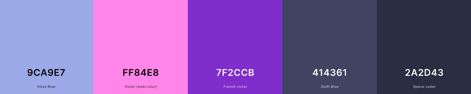
In addition I also have white (#FFFFFF) and black (#000000) to play with.
Check out our guide on creating a great colour palette for apps.
I dropped these colours into an amazing tool called EightShapes Contrast Grid, which output this colour matrix:
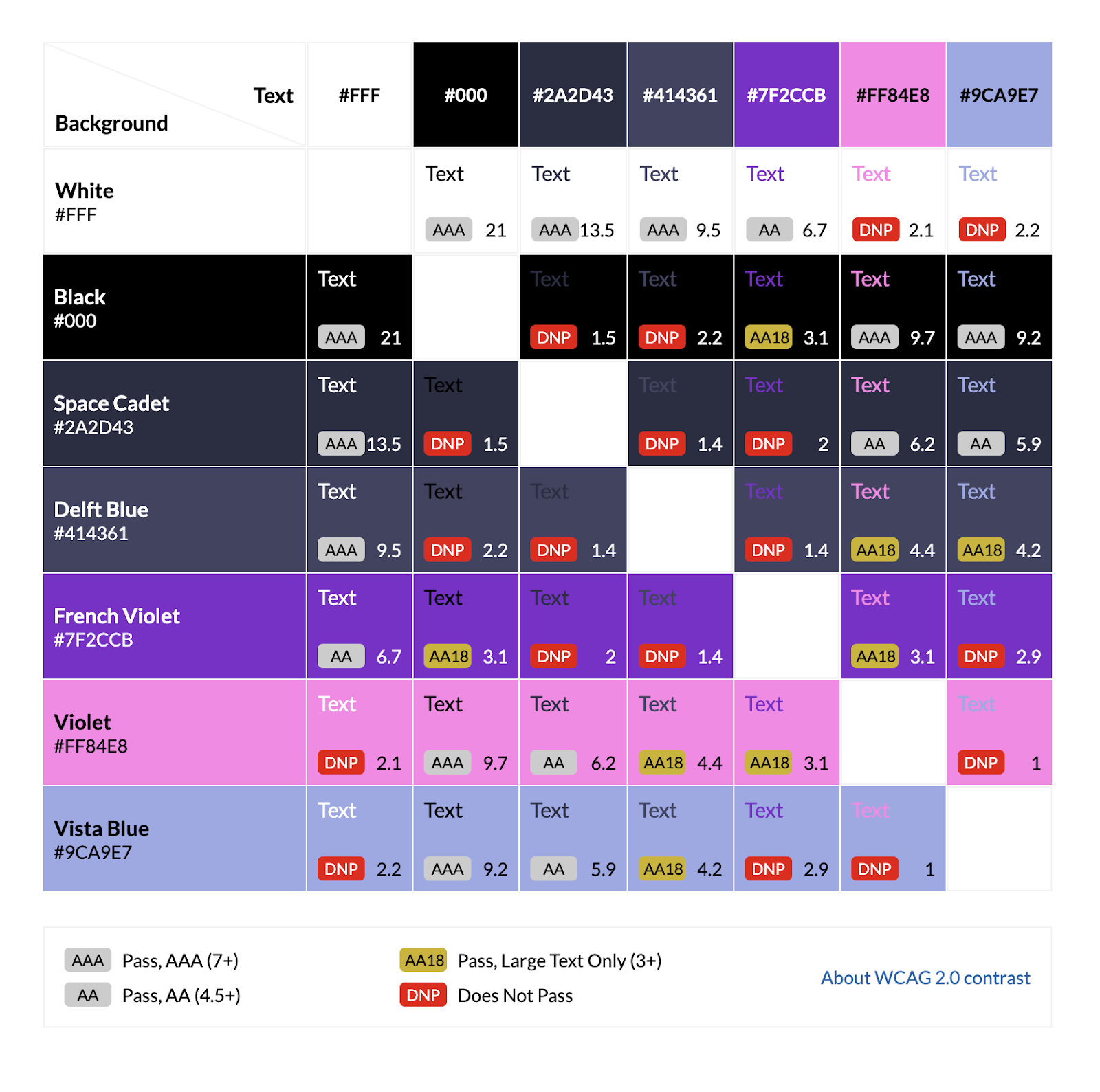
This shows me the brand colours’ contrast value for each combination, and the standard they meet for type. All the way from DNP (Does Not Pass) to AAA (the golden standard).
We can see that White text on French Violet background gives us an AA pass, but Vista Blue text on the same colour background is a DNP — Does Not Pass.
As this matrix is a live HTML file, I can import that into my Figma design system file, then edit and annotate to my heart's content.
Standards for objects are not shown on this matrix, but in summary:
User interface components or information essential graphical components will share the contrast pass value with the 18pt and above text ratio.
Non-essential graphic components are exempt from rating.
See the table above for a quick reference, or for more information check WCAG’s website.
How about if you’re struggling with the colour palette?
What if your colours can’t be used against each other?
If you’re the brand owner and the palette is in its infancy, then you have an opportunity to tweak those colours to make them easier to utilise. If you have a very light palette, consider adding one or two stronger colours. Equally, a strong palette will often welcome a softer colour or two.
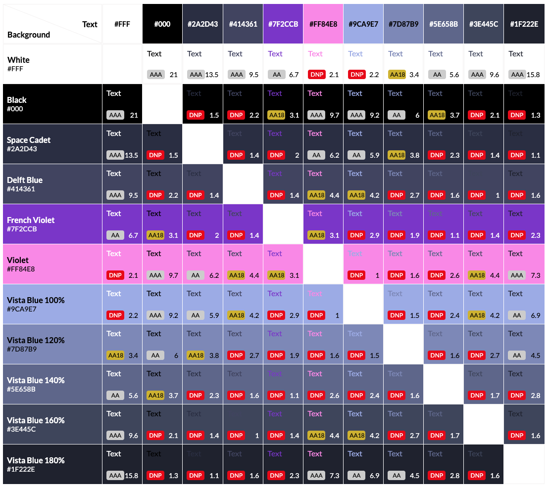
What about if you’re working for a client with an established suite of colours? Slightly trickier, but there are still options. Using a tool like this tint and shade generator, you can flesh out the palette with tint variations of the brand colours — from 0% to 200%.
So, maybe at 100% a brand colour doesn’t meet AA standard when sat as type on another, but perhaps it does at 120%… You can add these variations to your EightShapes grid, as shown here (adding 120%, 140%, 160% and 180% tints to Vista Blue).
Note: always take care when adapting a client’s palette — in my experience, if done respectfully and with the buy-in of the client you won’t often face push-back.
How can UX Designers optimise typography for accessibility?
Looking for something else?
Search over 450 blog posts from our team
Want to hear more?
Subscribe to our monthly digest of blogs to stay in the loop and come with us on our journey to make things better!
