


How to make good colour choices for your mobile app
For non-designers, it can be hard to understand why the process can take so long - surely it’s not that hard to make an aesthetically pleasing app that users will come back to? And isn’t that the most important thing? Spoiler alert: no.
As it turns out, there’s more to app design than whatever is trending on Dribbble. The choice of colours not only affects how users feel when they experience products, but also if they’re even able to read the carefully constructed copy that the marketing team scrutinized over.
Let’s dive into a bit of colour theory to find out how to select colours for your product, and why accessibility matters.
Colours have feelings too
Well, sort of. If you visited a spa for a spot of relaxation and the walls were all painted bright red, it would be a very different experience to one where the colour scheme was soothing blues. The psychology behind colour is fascinating, and vast, so I’ll only touch lightly on it but research suggests1 that light shades of blue are calming2. When it comes to app design, dark blues are often used by financial companies as this shade of blue evokes trustworthiness and maturity. Conversely, warmer colours like red can actually have the opposite effect - possibly even raising blood pressure and respiration rates3. So let’s avoid angry red spas for now - or using red in apps for subjects like meditation and mindfulness.
Every colour has its own connotations. There is also a great deal of variation even within one colour as different shades can mean very different things. For example, green can connote nature, spring, new beginnings, growth, luck and contradictingly, envy depending on the context and the shade (this can even vary between countries and cultures - the examples I’ve used are based on a UK audience).
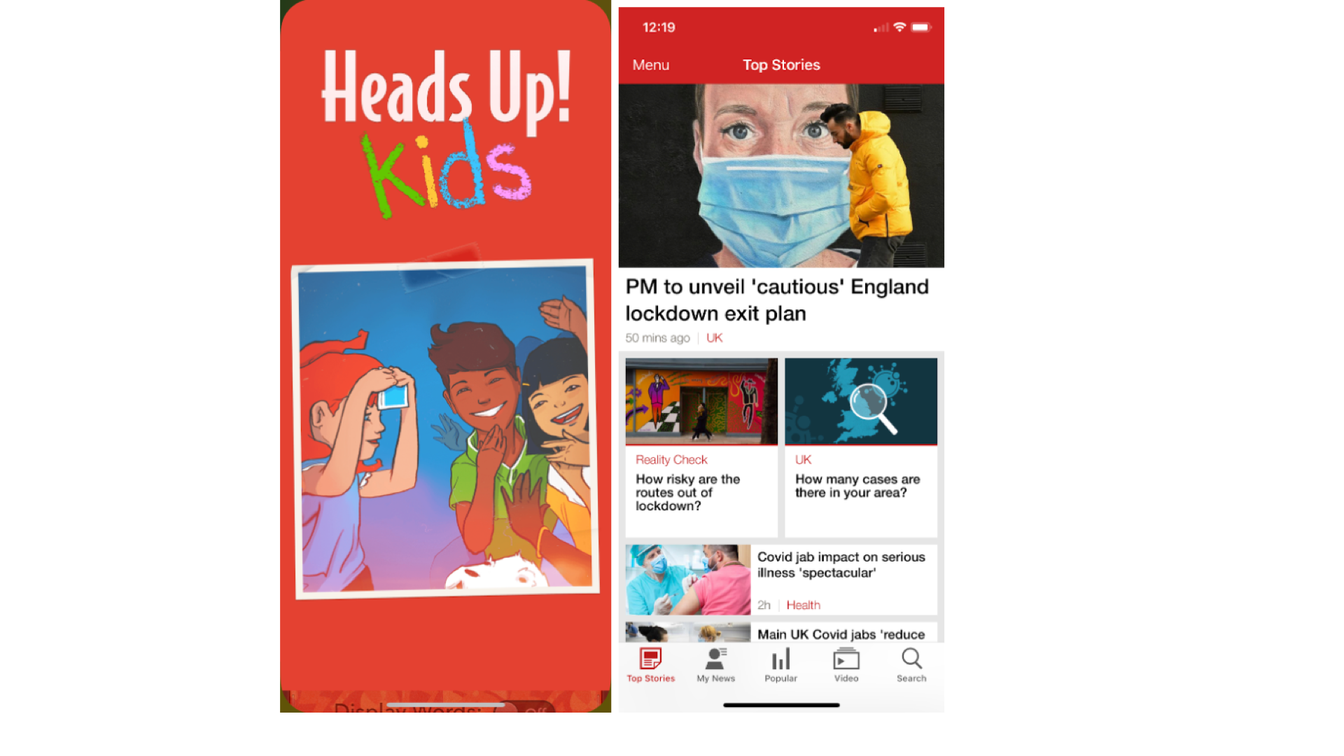
Choosing colours for your app really depends on the target audience and content of your app. Gaming apps for children are often in bright, attention-grabbing colours like yellow and red. The BBC News app also uses red in its navigation to denote the importance of its content.
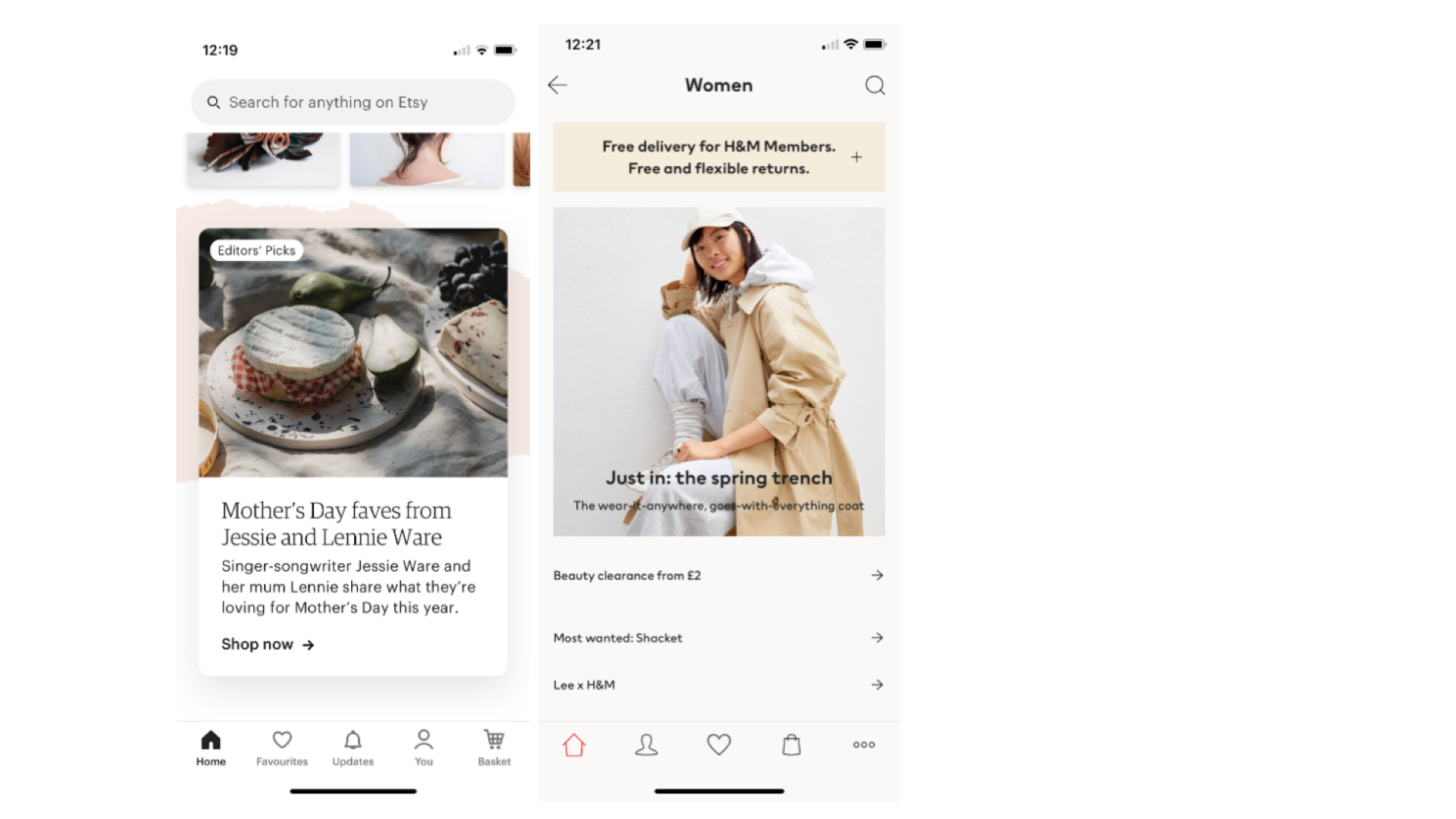
E-commerce apps like Etsy and H&M often use white or off-white with light, neutral accents. Both are photography heavy so deliberately avoid using background colours and buttons that are too garish in order to give the products centre stage. This can also be seen in the Waterstones app.
Apps are for everyone
When app designers start out in their career without knowing about accessibility and UX (user experience) often they will create beautiful designs that are also heavily impractical. One common mistake is to design components like buttons with white text and a solid background colour, as this doesn’t allow for sufficient contrast. The same is true of components where the text is black and the background too dark.
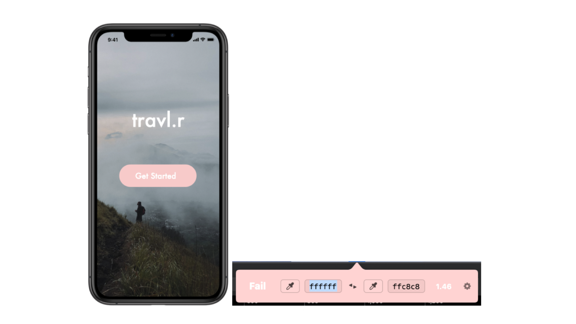
This may look nice, but the pink background of the button is too light.
I often use a Contrast checking tool to ensure that my designs are accessible for people with visual impairments - this is a handy little tool you can use to grab the hex codes of two components and compare them. It will tell you whether the contrast ratio fails or succeeds. Contrast doesn’t matter so much in decorative elements, but it’s crucial to ensure that text is readable - otherwise, the text may as well not be there.
It's important to check numerous other accessibility issues when designing apps, including minimum font size and choosing a font, particularly for body text. You want a font that’s not too curly or cursive. A good resource for app layout and accessibility is Google’s Material guidelines.
With an estimated 15% of the world’s population having some kind of disability or impairment, it makes sense ethically (as well as financially!) to design apps that are accessible to everyone. There’s little point spending hours crafting something that millions of potential users can’t access.
Hatching a scheme
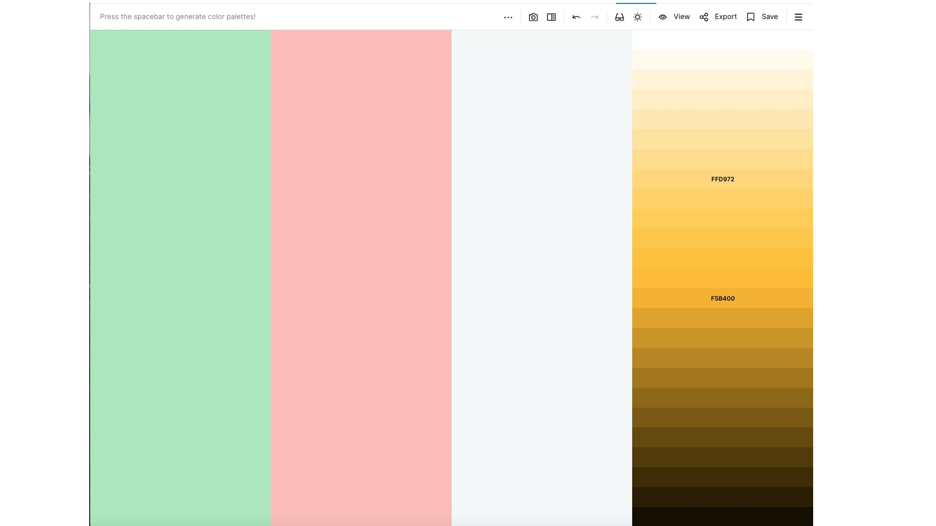
Colour schemes can be really difficult to create, especially if you’re working with existing brand colours that are very vibrant and bright. Coolors is a helpful website when thinking about colour palettes as it allows you to see how different colours work next to each other, allowing you to alter the shades and tones to find the right fit.
If your app displays data like graphs and charts, make sure your colour library has multiple shades and tones of the colours you want to use, with sufficient contrast between them so the data is easily digested.
Armed with the knowledge of which colours to choose to convey the right message to your audience, and ensuring that the way you use them is accessible for your users, you’ll be well on your way to a great colour scheme. To read more about colour choices in apps, check out Jotham’s blog.
1https://www.psychologytoday.co...
Looking for something else?
Search over 450 blog posts from our team
Want to hear more?
Subscribe to our monthly digest of blogs to stay in the loop and come with us on our journey to make things better!
